How to Create Charts in Excel
Creating charts in Excel
You can create charts in Excel to showcase trends and make comparisons. Charts enable you to present worksheet data in graphical form. They also allow you to highlight trends, see the parts that make up a whole, or show comparisons. When you create a chart, the source worksheet data is linked to the chart. So when you update the data in your worksheet, the chart gets updated, too. In Excel, you can add a chart directly to the worksheet as an object or you can create a separate chart worksheet.
Creating a chart in Excel
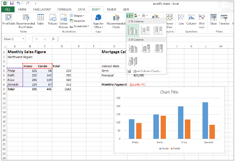
You can create a chart from a range of data contained within a file such as a CLustered Colum chart:
- Choose File > Open, click Computer in the Backstage view, and click Browse.
- Navigate to the Excel05lessons folder and open the file named excel05_charts.
- Choose File > Save As, and choose Computer.
- Click the Browse button, navigate to the Excel05lessons folder, name the file excel05_charts_final, and click Save.
- Select range A4:C8.
- From the Insert tab, choose Insert Column Chart.
- From the 2-D Column section of the drop-down menu, select Clustered Column.
Convert your worksheet data into easy-to-read charts.
Excel adds the chart to the worksheet and highlights the source data used by the chart.
|
 When selecting data for a chart, include headings and labels, but do not include totals and subtotals.